The Lane Brand
A brand identity that accurately represents the fun, welcoming, and relaxing nature of The Lane.
Client:
The Lane
Date:
2019
Scope:
Brand definition
Visual identity System
Brand Guidelines
Creative Direction
Messaging


Design Direction
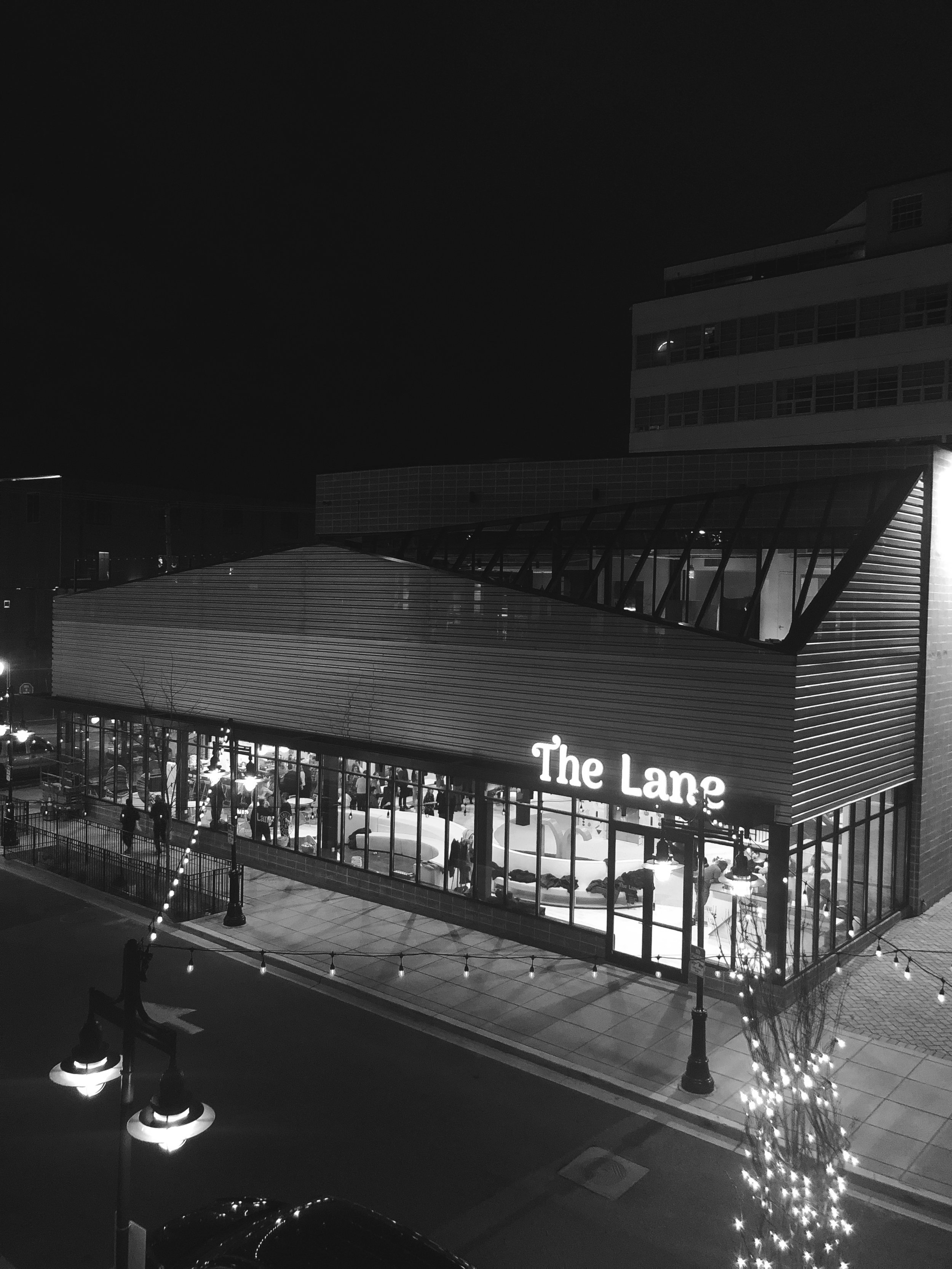
Rachel and Molly approached me with a vision for The Lane, a vibrant gathering space for modern families in Washington, DC. Their dream was to create a place where kids could play freely and adults could relax—somewhere that felt joyful, stylish, and welcoming to all ages.
They needed a brand identity that captured this spirit: fun, nostalgic, and emotionally resonant—a brand that felt like a trusted friend and a beloved neighborhood hub.

Approach
To bring The Lane’s vision to life, I developed a brand identity rooted in comfort, joy, and style, drawing inspiration from vintage aesthetics, family values, and playful design.
We focused on building a visual language that felt genuine and familiar, with a tone that was irreverent yet kind. Everything—from the typography to the color palette—was crafted to reflect a space that’s warm, inclusive, and full of life.
Logo
The Lane’s primary logo features hand-drawn letterforms that are both stylish and nostalgic. There’s a confidence and weight to the form that conveys trust, while still feeling approachable and fun. It’s a logo that feels right at home whether printed on a sign, a t-shirt, or a child’s birthday invitation.
Custom Seal
One of the most meaningful elements of the identity is The Lane stamp—a visual mark that reflects the heart of the business. The word “Lane” isn’t just the brand name; it’s also made up of the first initials of each founder’s child. This stamp represents The Lane’s deep-rooted connection to family and serves as a versatile, secondary brand mark.

Typography and Color
We paired a customized version of Arima Madurai for the wordmark with two supporting typefaces:
Oswald for bold headlines and calls to action
Arsenal for clear, readable body copy
Together, this typography system balances functionality with a playful, modern edge.
The Lane’s color palette was inspired by fruit, retro appliances, and vibrant childhood memories. Primary colors include a lush emerald and soft blush, while accents of lemon, lime, and tangerine add brightness and energy. Used together, they evoke a nostalgic yet refreshing vibe—equal parts familiar and unexpected.
“Marcela is a great and thoughtful designer. She will listen to your ideas, walk through ideas and visual boards with you, and make sure you get to a happy place.”
— Rachel, Co-founder, The Lane